Future 404
Logo and brand kit created for Future 404, a Think-Tank in Reykjavik, Iceland.
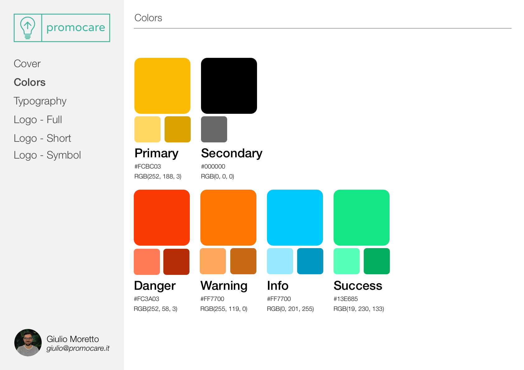
Colors
The main colors of the client’s graphic identity were chosen.
Yellow and Black were chosen as the primary and secondary colors, adding a lighter and a darker shade where possible.
In addition, colors were added for the states of danger, warning, information, and success for possible applications on sites and applications.
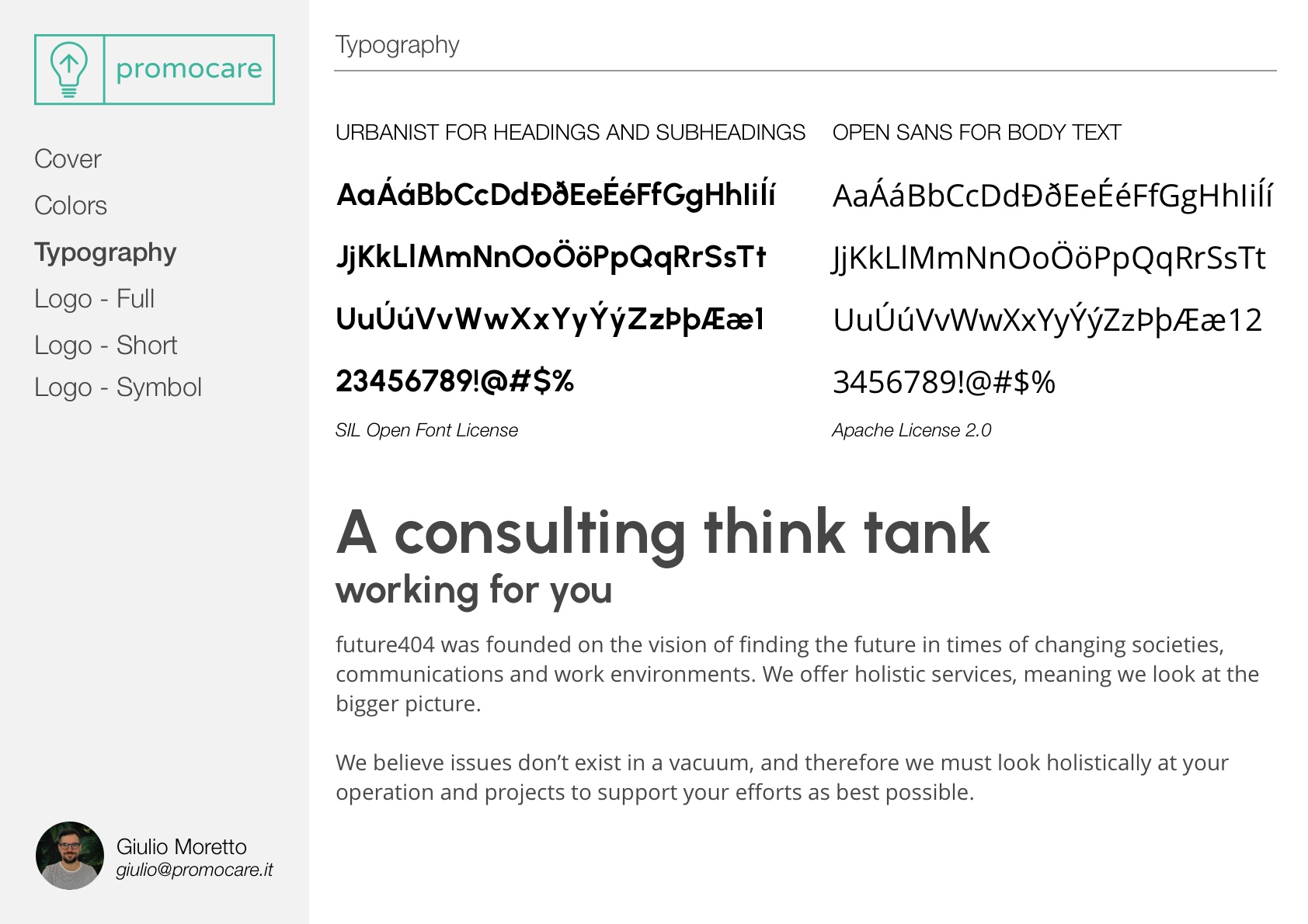
Typography
Two fonts were chosen-one for headings and one for normal text.
I paid special attention to supporting fonts used in the Icelandic and English languages in addition to other Nordic fonts.
The chosen fonts have Open Source licenses in order to be free to use them in any field.
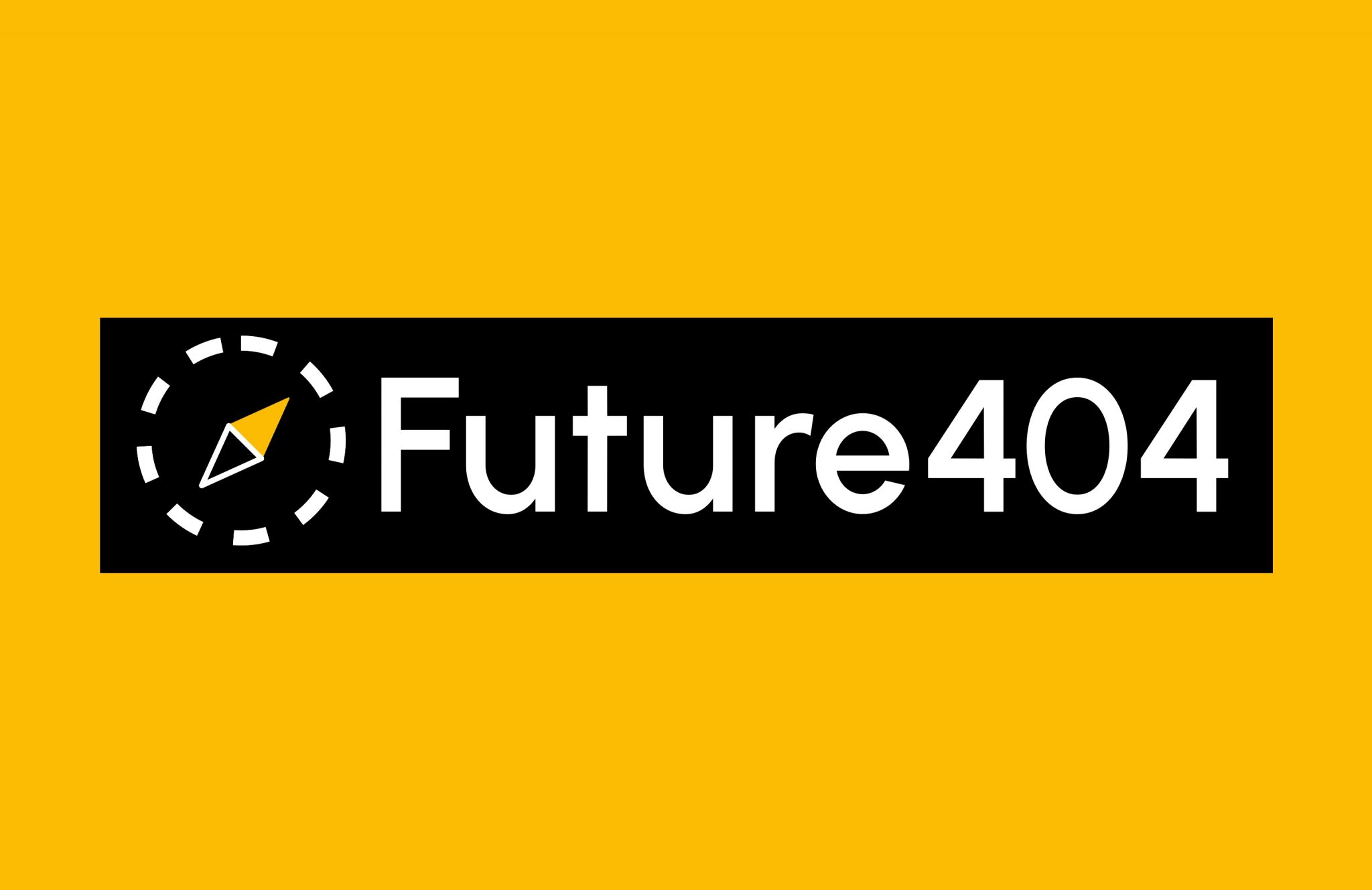
Logo: full format
The full-size logo shows the company name in full by recalling the following elements:
- The censor bar found in confidential documents
- The compass to give direction to customers
- The dotted border of the compass recalls the notion of “not found” also evoked by the 404 number in the name (page not found error)
Several alternatives were created including black and white for printing.
Logo: Short Format
The above logo elements remain unchanged but in a smaller format.
This format uses an abbreviation of the name often used by the client.
Several alternatives have been created including black and white for printing.
Logo: Symbol only
A logo format containing only the compass symbol was also created.
Being characteristic of the logo this can be used without the text with applications ranging from letterhead to pins and stickers.